Toronto Comicon Motion Design Package
Every year, tens of thousands of people from all walks of life flock to the Metro Toronto Convention Centre to unite in the name of fandom. From sci-fi, to anime, to horror, there is something for every fan to enjoy at the show.
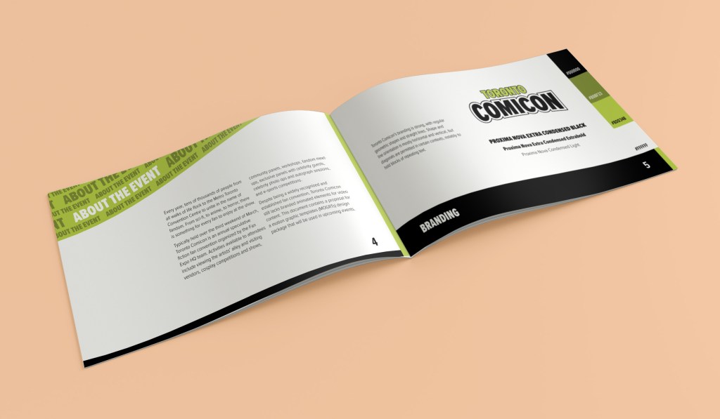
Despite being a widely recognized and established fan convention, Toronto Comicon still lacks branded animated elements for video content. For this project, I assessed Toronto Comicon’s brand identity to create a motion graphic design package. This design package contains six motion graphic templates (MOGRTs), a video showcasing the MOGRTs, and a design package overview document.
Please note that I am in no way affiliated with the Toronto Comicon brand. This is a project created for educative purposes.
Skills
Motion design, MOGRTs, animation, filming, video editing
Software
Adobe After Effects, Adobe Premiere Pro, Adobe InDesign
Branding
Toronto Comicon’s branding is strong, with regular geometric shapes and straight lines. The orientation of shapes and line is mostly horizontal and vertical, but diagonals are used in certain contexts, notably to hold blocks of repeating text.
Tone of Voice
Toronto Comicon’s tone of voice is anticipatory and empowering. All communications on their website and social platforms aim to create anticipation and excitement about the event and to plant seeds of fear of missing out (FOMO) in their target audience. They also aim to empower fans by addressing them as the main characters of their own adventure and heightening their fandom’s sense of unity.
Secondary qualifiers for the brand’s tone of voice are: informative, conversational, respectful, enthusiastic.
Target Audience
Toronto Comicon attendees are highly passionate individuals, often with artistic inclinations. Attendees’ interests are spread over the following areas: alt/small press, anime/manga, comic book, comic/genre-based media, tabletop/RPG, sci/fantasy, video games, tv shows, horror, and cosplay. While there isn’t a single point of interest shared by all attendees, they are, as Fan Expo HQ puts it, “united by fandom”.
Design Approach
The following guidelines were taken into account to ensure that the design package was cohesive with Toronto Comicon branding:
- Only official Toronto Comicon colours are used in graphic elements
- All shapes are of a solid colour
- All graphic elements are opaque, unless they serve as a colour overlay over live-action footage
- Graphic elements have primarily straight or angular components
- Typography follows branding guidelines
In addition, the following guidelines were respected to ensure that the design package adhered to Toronto Comicon’s anticipatory and empowering tone of voice:
- Motion is fast and direct
- Motion is primarily straight and angular
- Leading lines draw the eye to interviewees to show them as the hero of their capsule
Design Package Contents
Six MOGRTs were created for Toronto Comicon “Choose Your Character” capsules, bite-size video interviews of attendees, vendors or celebrity guests sharing their experience with the show. These capsules are to be shared on the brand’s social platforms to promote the event and create community engagement. The design package contains the following MOGRTs:
- Intro with logo
- Transition
- Info card
- Lower thirds (short)
- Lower thirds (long)
- Outro with logo
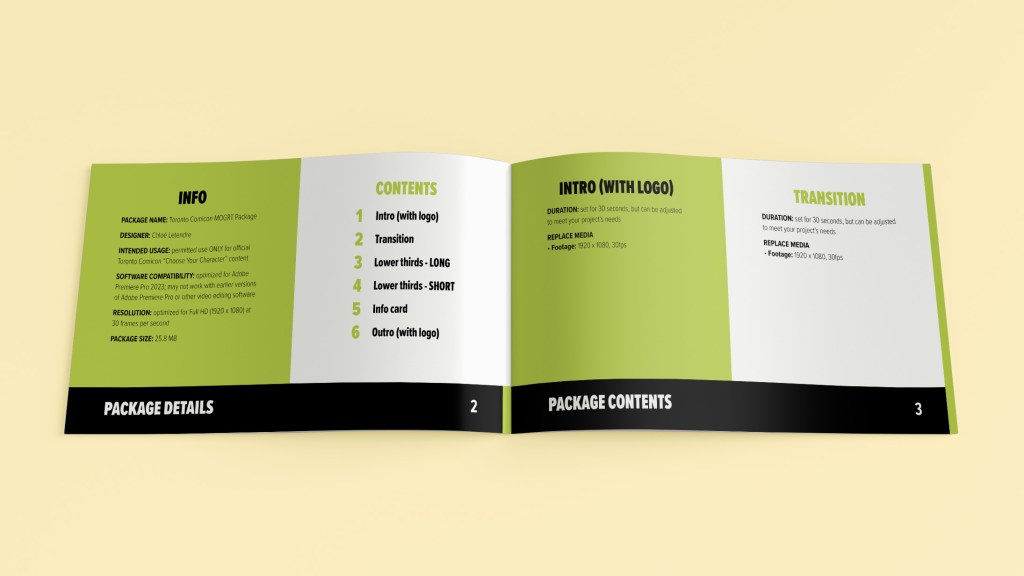
Design Package Specifications
- Resolution: 1920 x 1080
- Frame rate: 29.97 fps
- Live-action composited shots are replaceable files
- Files include adjustable elements when necessary
- Protected regions are indicated
A video showcasing the MOGRTs is provided to serve as a template for the design package.
Design Package Overview
An accompanying written overview of the design package is provided to give package specifications and instructions for using the MOGRTs.
