Arboretum Brand
Arboretum is a new and upcoming tech startup that provides users with an opinionated note-taking and information management platform guided by principles of connectivity and organization. By building complex webs of knowledge from unstructured text, Arboretum gives users the tools they need to separate the signal from the noise and discover real insights within vast bodies of content.
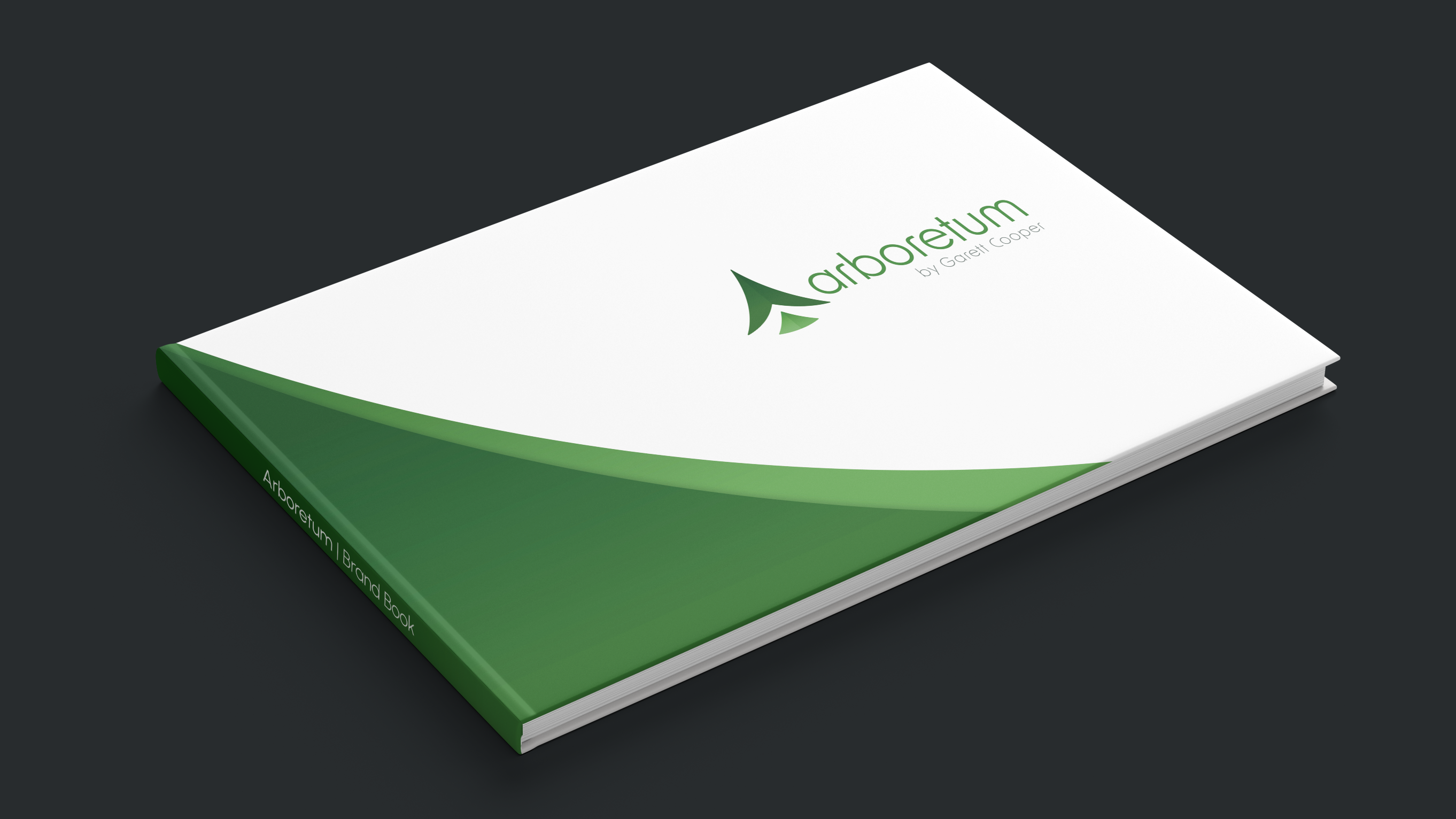
I was approached by Arboretum’s creator, Garett Cooper, to design a brand for his company. This project showcases Arboretum’s logo design and brand book, which touches on logo usages, integrity of the mark, colours, typography, graphic elements, and brand applications.
Skills
Graphic design, print layout, web design, writing
Software
Adobe Creative Suite (Illustrator, Photoshop, InDesign), Figma
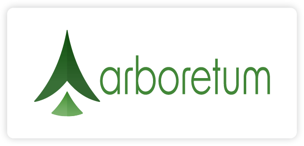
Logo
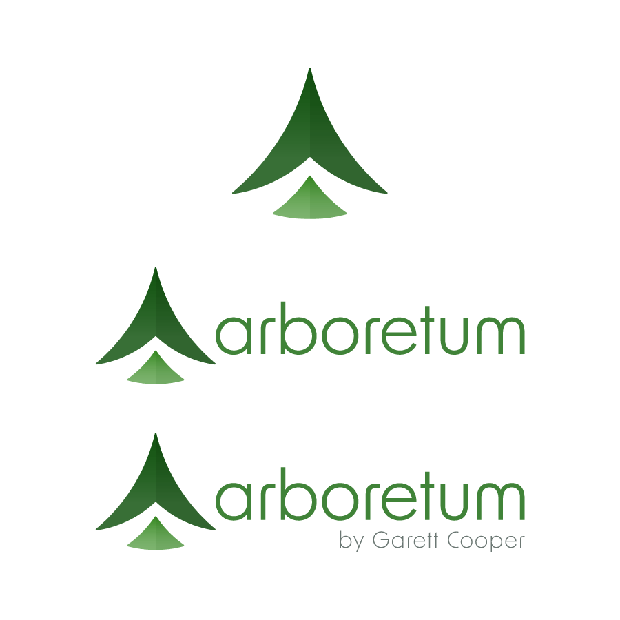
Arboretum’s logo may depict a simplified tree, yet it’s anything but simple. Look beyond the shapes, and you’ll see within it countless ideas linked together in a web of branches. And just like the branches of the tallest trees, this network is driven by order and streamlined into a system optimized for growth.
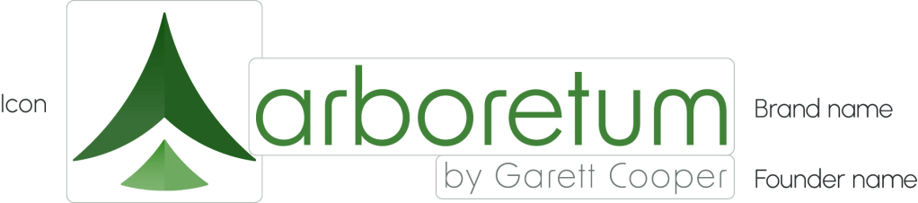
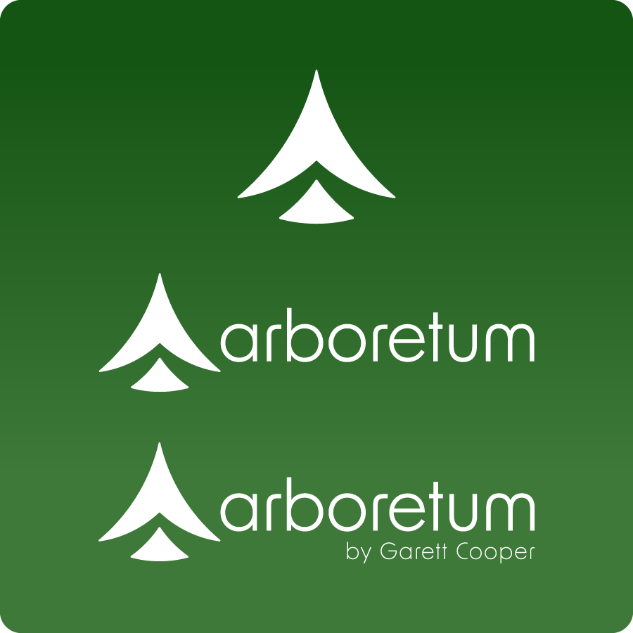
The icon, brand name, and creator name can be combined to create the three approved Arboretum logos: the icon logo, the wordmark logo, and the creator name logo. In addition, black and white versions of all logos were created for use on backgrounds where the full colour version is not possible.
Full Colour – Light
The full colour logo should always be considered as the first design option

Black
For use on light backgrounds where the full colour version is not possible
White
For use on dark backgrounds where the full colour version is not possible
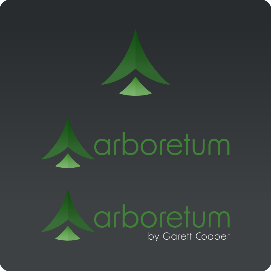
Full Colour – Dark
The full colour logo should always be considered as the first design option
Integrity of the Mark
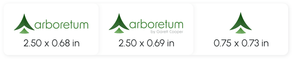
The logo should always be sufficiently isolated from all graphic elements that might detract from it: it must be at least the full height of the Arboretum “T” away from page edges, text, illustrations, photographs, and any other graphic element.

In order ensure legibility, use of the logo on printed materials must comply with the provided minimum dimensions. There are no minimum dimensions for web.
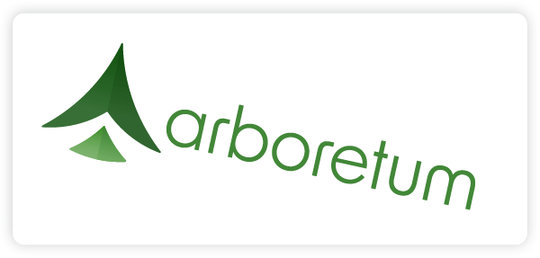
Alterations to any variation of the logo are strictly prohibited, including the following examples:

Do not deviate colour from standards

Do not print the logo on complex photographs
Do not rotate the logo to any degree

Do not alter the opacity of the logo

Do not fill shapes with patterns or effects
Do not skew or scale the width or height

Do not violate the signature clear zone

Do not modify internal elements of the logo
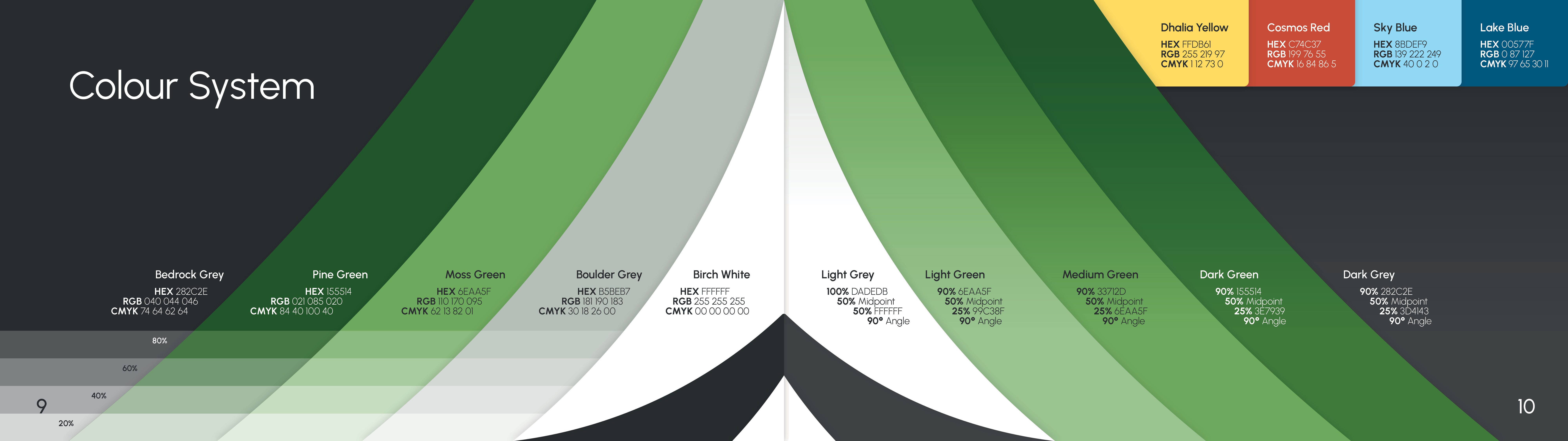
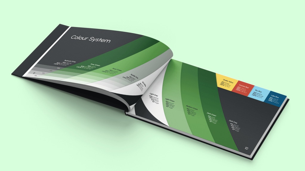
Colour System
Blending nature and technology is a fondamental aspect of Arboretum’s brand identity. As such, its colour system harmonizes natural greens with industrial greys.
Bedrock Grey and Pine Green are the brand’s primary colours, with Moss Green, Boulder Grey, and Birch White being its secondary colours. The brand’s tertiary colours – Dhalia Yellow, Cosmos Red, Sky Blue, and Lake Blue – are to be used sparingly to highlight important information.
Specific gradients made from primary and secondary colours are to be used as the the first design option for backgrounds.
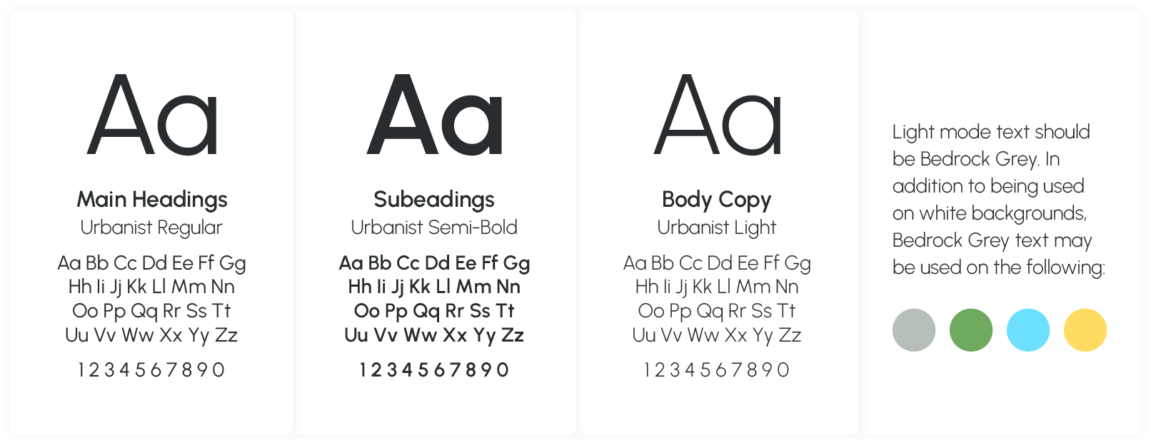
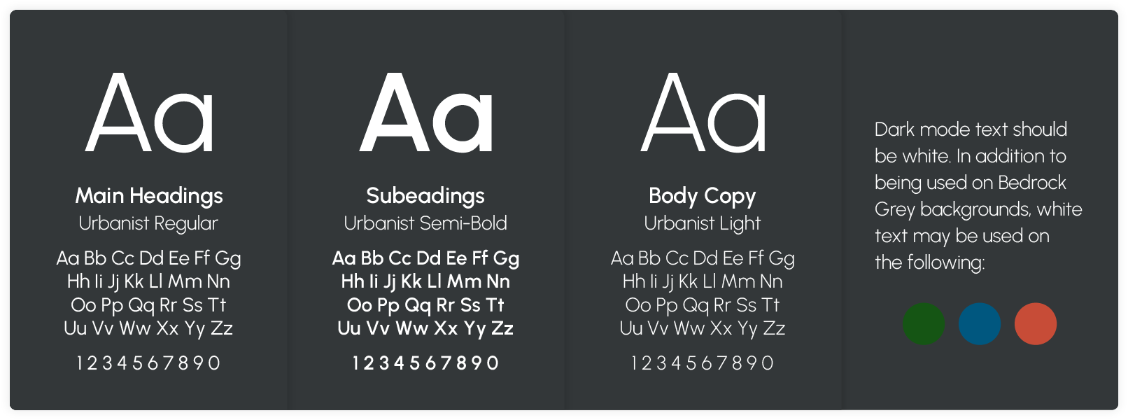
Typography
Urbanist was chosen as Arboretum’s primary typeface because of its clean and modern appearance, and should be used for all of Arboretum’s print and web usages. Urbanist Regular is to be used for headings; Urbanist Semi-Bold is to be used for subheadings; and Urbanist Light is to be used for body copy, with accented terms using Urbanist Bold or Urbanist Light Italic.
Light mode text should be Bedrock Grey/black. In addition to being used on white backgrounds, Bedrock Grey/black text may be used on Boulder Grey, Moss Green, Sky Blue, and Dhalia Yellow.
Dark mode text should be white. In addition to being used on Bedrock Grey backgrounds, white text may be used on Pine Green, Lake Blue, and Cosmos Red.
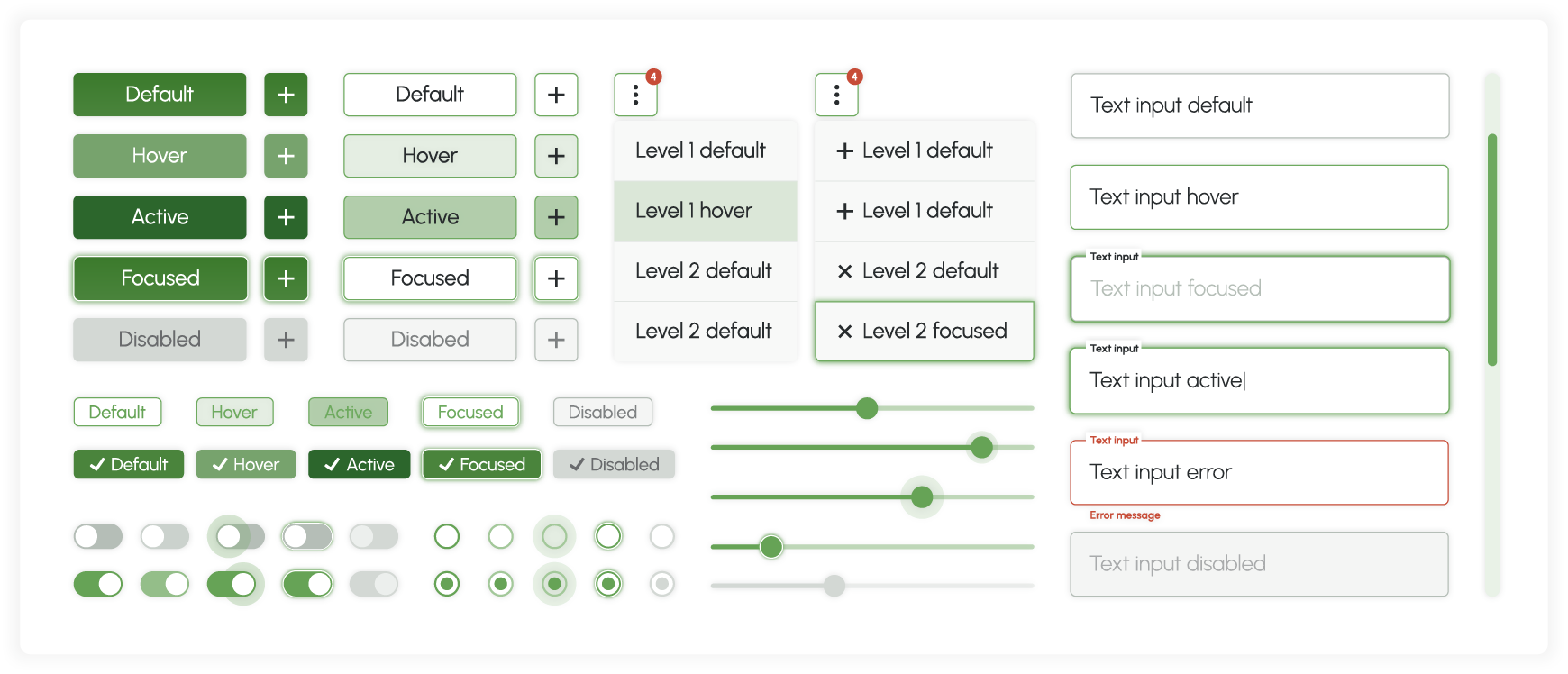
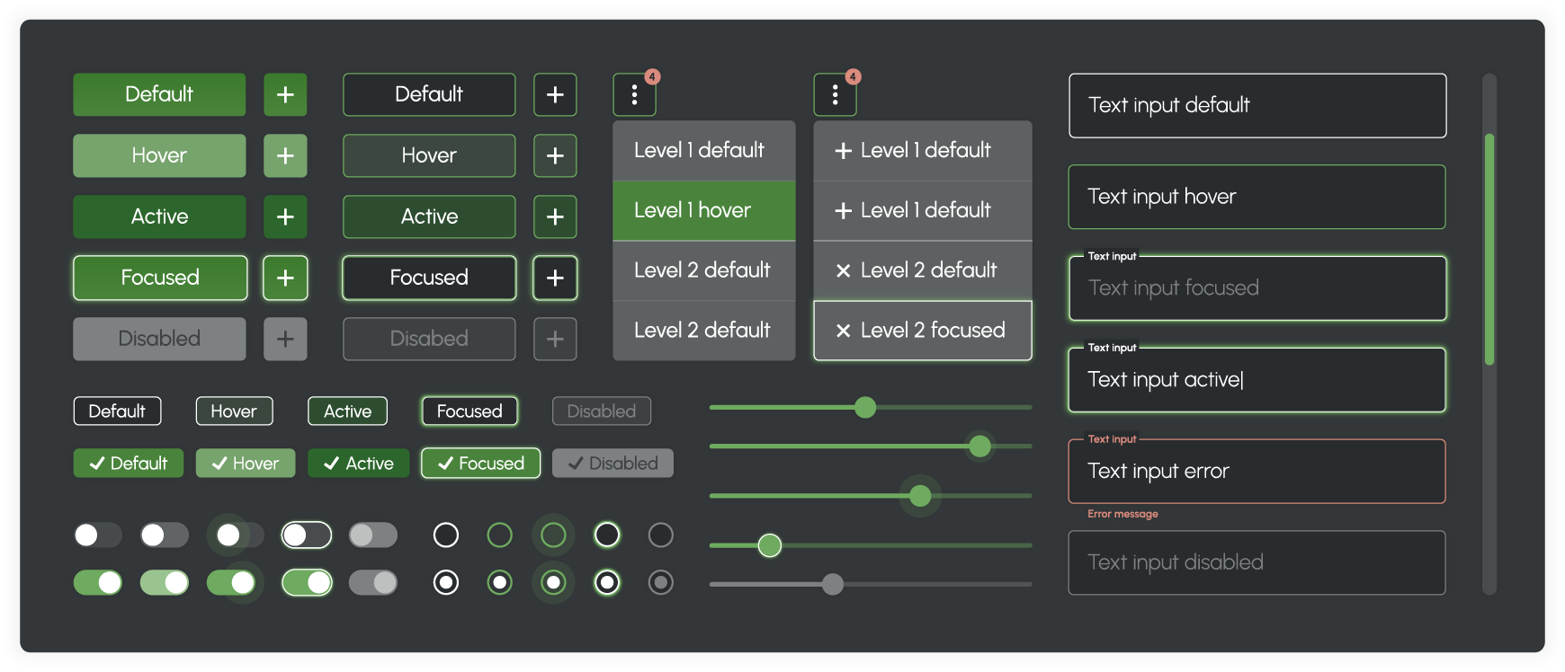
Graphic Elements
The Arboretum brand identity was designed with digital applications in mind. As such, graphic elements are an integral part of this identity. The following elements were designed as a starting point for Arboretum’s future website and desktop app design. Graphic elements for both light and dark modes were created.
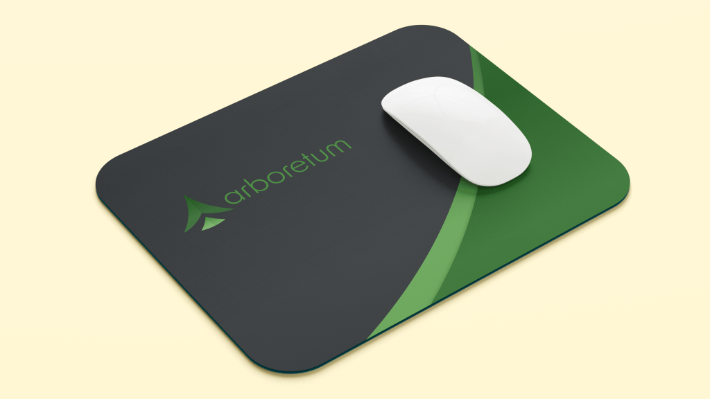
Brand Applications
While Arboretum operates in the digital world, its brand identity can be applied to a plethora of real-life items! From apparel, to office accessories, to street posters – the applications are endless!


Want to see more Arboretum? Click here to view the full brand book!
